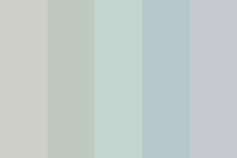
Decoding the Ash Blue Aesthetic: A Modern Color Story

The world of color is a fascinating landscape, constantly evolving and revealing new favorites. One shade that has firmly planted itself in the contemporary aesthetic is ash blue. But what exactly is this nuanced hue, and why is it capturing the attention of designers, artists, and everyday enthusiasts alike? Let's delve into the intriguing world of the ash blue color spectrum.
Ash blue isn't just a single shade; it's a spectrum of cool, muted tones that evoke a sense of tranquility and sophistication. Imagine the soft, dusty blue of a winter sky just before dawn, or the subtle grayish-blue of weathered wood on a beach. This range encapsulates the essence of ash blue, a color family that walks the line between blue and gray, offering a calming yet complex visual experience. Its muted nature makes it surprisingly versatile, adaptable to a wide variety of applications, from interior design and fashion to branding and digital art.
Pinpointing the precise historical origin of the ash blue color palette is difficult, as color naming and perception have evolved over time. However, we can trace its influence through various historical periods. Shades similar to ash blue can be found in ancient pottery glazes and textiles, hinting at an enduring appeal. More recently, the rise of minimalist and Scandinavian design has brought renewed focus to cool, muted tones like ash blue, solidifying its place in the modern design lexicon.
The importance of the ash blue palette lies in its ability to create a sense of calm and serenity. Unlike vibrant blues, which can be energetic or even overwhelming, ash blue offers a more subdued presence. This quality makes it an excellent choice for spaces where relaxation and focus are desired, such as bedrooms, living rooms, or even office environments. The inherent neutrality of ash blue allows it to blend seamlessly with other colors, making it a versatile foundation for a variety of design schemes.
One potential issue with using an ash blue color theme, especially in larger spaces, is that it can feel cold or sterile if not balanced properly. The key is to incorporate warmer accents and textures to create a more inviting atmosphere. Natural wood tones, soft textiles, and metallic accents can all contribute to a more balanced and welcoming ash blue environment.
Creating an ash blue color scheme involves selecting a range of complementary hues that enhance the overall aesthetic. This might include lighter tints of ash blue for walls, darker shades for furniture, and accent colors like warm grays, creams, or even muted greens or yellows to add pops of interest.
Benefits of using this color palette include its calming effect, its versatility in different design styles, and its ability to create a sophisticated and modern look. For instance, in a bedroom, ash blue walls can create a tranquil ambiance conducive to sleep. In a living room, ash blue furniture can provide a stylish backdrop for other decor elements.
An action plan for implementing ash blue could involve first identifying the space you want to transform, then choosing a specific range of ash blue hues, and finally selecting complementary colors and textures to create a cohesive design.
Advantages and Disadvantages of Ash Blue Color Palette
| Advantages | Disadvantages |
|---|---|
| Calming and relaxing | Can feel cold if not balanced |
| Versatile and adaptable | May not be suitable for all design styles |
| Creates a sophisticated look | Can appear dull without sufficient contrast |
Best practices include using a variety of shades of ash blue to create depth, incorporating warm textures to balance the coolness, and using accent colors strategically to add visual interest.
Real-world examples of effective ash blue use include Scandinavian-inspired interiors, minimalist branding designs, and fashion collections featuring muted blue garments.
A challenge might be achieving the right balance of cool and warm tones. The solution is to experiment with different textures and accent colors to find the perfect mix.
FAQ: What colors go well with ash blue? How can I use ash blue in a small space? What are the different shades of ash blue?
Tips: Use natural light to enhance the beauty of ash blue. Pair ash blue with metallic accents for a touch of glamour.
In conclusion, the ash blue color palette offers a unique blend of tranquility and sophistication that has resonated with designers and individuals alike. Its versatility, calming effect, and ability to create a modern and stylish aesthetic make it a valuable tool for various creative applications. From interior design to fashion and branding, ash blue provides a subtle yet powerful way to express a sense of calm, elegance, and contemporary style. Whether you're looking to create a relaxing atmosphere in your home, develop a sophisticated brand identity, or simply add a touch of understated elegance to your wardrobe, exploring the nuances of the ash blue spectrum is a journey worth taking. Embrace the subtle power of ash blue and unlock a world of design possibilities.
The crystal ladys secret revealed in chapter 9
Spice up your life unleashing the power of spiced berry paint
Sweet morning messages brightening your girlfriends day


